- [2016] What chance the following Democrats have to defeat the Republican nominee in the 2016 presidential elections?
- [2016] What chance the following Republicans have to defeat the Democrat nominee in the 2016 presidential elections?
- [2016] Who would be your ideal left-wing candidates for the 2016 presidential elections?
- [2016] Who would be your ideal right-wing candidates for the 2016 presidential elections?
- [2016] Whom would you bet will win the Democratic nomination for the 2016 presidential election?
- [2016] Whom would you bet will win the Republican nomination for the 2016 presidential election?
Usability fix: new poll options and new votes
Wed, 07/17/2013 - 08:17 — augustin
Just a couple of days ago, I committed an important usability fix, making it much more convenient for returning members to check upon their past polling activity. Below each poll, there used to be a plain ballot, with either some default values filled in or with the voter's previous vote filled in.
One great feature of this site is that polls are usually not fixed, and new polling options can be added by members at any time. Thus, if a member has a better idea than anything that is currently proposed , she can add it straight away, and let the other members vote accordingly.
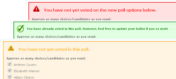
However, that feature caused problem because of an annoying usability bug: a member who had already voted on the previously offered options but not on the newly added ones couldn't really make the difference between the old options and the new ones. Now, it's all clearly indicated. New poll options are highlighted in red so that they stand out in the list of options.

Beside, in your Polling Station, a new list of polls with new options would appear whenever appropriate. The number of new options will be clearly indicated. Besides, you can also see the number of new votes since last time you visited a poll.
- augustin's blog
- Login to post comments